We’re back with another collection of useful links and resources in the run up to news:rewired – noise to signal, this time looking at session 2A: Developing the data story.
Speakers on the panel will include Michael Robinson, head of infographics, the Guardian and Federica Cocco, editor, OWNI.eu, with more speakers to follow.
I’m going to dive straight in at the deep end with this links post – which will look at developing a data story through visualisation – by linking to a post about visualising visualisations. This being journalism in 2011, the data trend was bound to go in for a bit of introspection sooner or later.
The excellent Guardian Data Blog has taken a look at the kind of things people have been visualising on the widely-used Many Eyes tool, scraped the data, and visualised the results. The result? Visualisations: visualised.
If that hasn’t left you reeling, here are some more blog posts, resources and examples to help get you in the mood for news:rewired’s developing the data story session.
Some useful blog posts
- From an unabashed visualisation celebration to a more cautious note, from the Data Driven Blog, about the dangers of “data porn”. Michael Greenfield asks whether some are sacrificing explanation and analysis for “quick visual gratification”: Data porn – where is the journalism?
- Journalism innovator and lecturer Paul Bradshaw published a book on data journalism last year, and his draft for a chapter on data visualisation is well worth a look: Data journalism pt3: visualising data – charts and graphs.
- An interesting post here from German news site Zeit Online, which used telephone records for Green party politician Malte Spitz (obtained by himself) and combined them with free online information relating to his life as a politician, such as Twitter feeds, blog entries and websites, to visualise his activity over a six-month period. Zeit Online: Tell-all telephone.
- We linked to parts 6 and 7 of this Stanford University video series on data journalism in a previous post, but take a look at part 2 and 3 about data visualisation and telling data stories.
- The New York Times looks at why data visualisation works, why our brains can comprehend certain things much more easily in visual, rather than lexical or numeric, forms: When the data struts its stuff.
Some free tools
Some examples
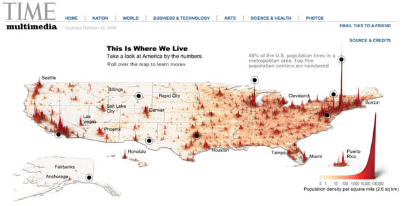
Time magazine produced this fantastic looking visualisation of population density in the US. More information is available about certain areas by hovering over the black dots.
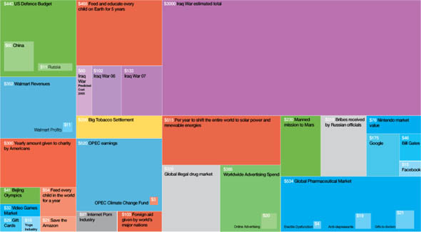
The Billion Dollar Gram was the result of David McCandless’ frustration with the difficulty of putting into context the billions of this and billions of that that crop up in news stories.
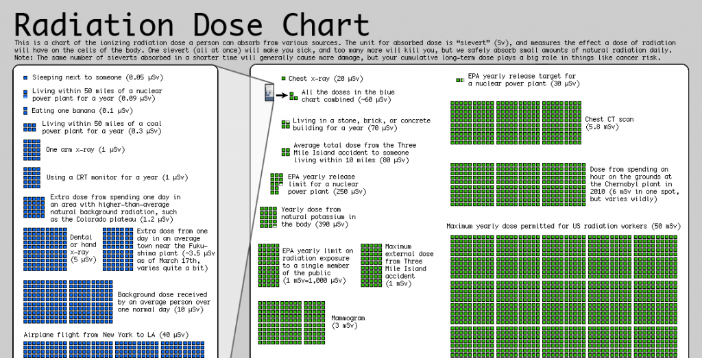
This recent visualisation from XKCD.com puts radiation dosages into context in the wake of Japan’s nuclear crisis. Sources for the data are built to the image as URLs too – nifty.
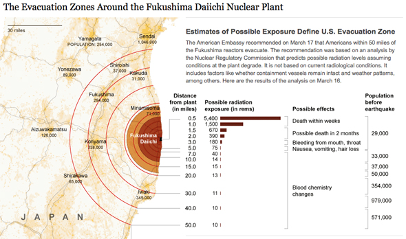
The New York Times has taken data describing the US recommended evacuation zones around the Fukushima nuclear plant and mapped the radiation levels and health risks.
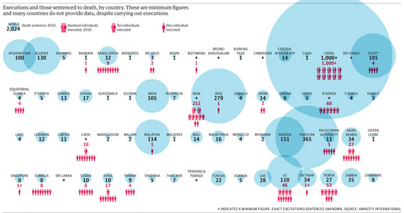
Another topical one, this time from the Guardian, which has compared the recently-released data on international executions and death sentences.
Buy tickets for news:rewired – noise to signal are available at this link.

