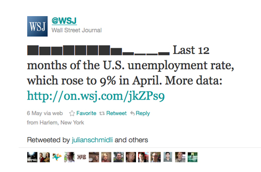
The Wall Street Journal has started using data visualisation (albeit in a fairly simple form) in tweets, using an online tool called Sparkblocks. The tweets are being called “sparktweets”.
And other so-called sparktweets have since been created:
We tracked the use of the hashtag #sparktweets using Hashtags.org:
Zach Seward’s blog explains how the Wall Street Journal’s unemployment sparktweet came about. He says that the team first tried using Unicode to display graphics in tweets, but found there were problems when viewing on Macs.
On Friday, we tried again, this time relying on a web-based tool by the Data Collective, which was inspired by Kerin and discovered by Albert Sun. It was the morning of the monthly jobs report, so we visualized the unemployment rate over the past 12 months. That’s the tweet above, which has been retweeted 249 times amid an enthusiasticreception.
If you’re using TweetDeck you’ll probably need to adjust your settings to view sparktweets (Settings / Colors/Font / check International Font/TwitterKey).
You can find out more about data journalism and data visualisations at news:rewired – noise to signal on 27 May. A full agenda is here and you can buy tickets (£130 +vat) here.
And let us know at @newsrewired if you create a #sparktweet.


